 वर्डप्रेस उत्पाद
 जूमला उत्पाद
 समर्थन
 समाचार
 लॉगिन
लॉगिनवर्डप्रेस में स्केल्ड इमेजेज को आसानी से सर्व करने का तरीका (कदम दर कदम)

क्या आपने कभी किसी साइट पर जाकर कुछ ही सेकंड में छोड़ दिया क्योंकि चित्र पर्याप्त तेज़ी से लोड नहीं होते थे? यही वह बात है जो आपके आगंतुक अनुभव कर सकते हैं यदि आप अपने WordPress साइट पर स्केल्ड इेजेज़ सर्व नहीं कर रहे हैं।.
यह समस्या तब होती है जब आपकी इमेजेज़ उनके डिस्प्ले आकार से बहुत बड़ी होती हैं, जिससे आपकी साइट धीरे लोड होती है और उपयोगकर्ता अनुभव पर नकारात्मक प्रभाव पड़ता है।.
लेकिन don't चिंता मत करो, we've आपका ध्यान रखा है! नीचे दिया गया त्वरित ट्यूटोरियल फॉलो करें ताकि आप आसानी से स्केल्ड इमेजेज़ सर्व करना सीख सकें!
सामग्री की तालिका
आपको स्केल्ड इमेजेज़ क्यों सर्व करना चाहिए?
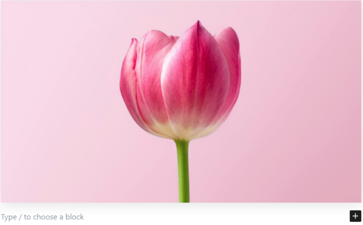
स्केल किए गए चित्र वे चित्र हैं जिन्हें वेबपेज पर प्रदर्शित होने के सटीक आयामों से मेल खाने के लिए पुनः आकार दिया गया है। यह मूल अपलोड्स से अलग है, जिनका आकार और रिज़ॉल्यूशन आमतौर पर बहुत बड़ा होता है।.
उदाहरण के लिए, आपका मूल फीचर इमेज 4000 x 3000 पिक्सेल हो सकता है, लेकिन आपकी वेबसाइट केवल इसे 800 x 600 पिक्सेल पर प्रदर्शित करती है। यदि मूल चित्र को स्केल‑डाउन संस्करण के बजाय उपयोग किया जाता है, तो आपकी साइट अधिक धीरे लोड होगी।.
जब छवियों को सही ढंग से स्केल नहीं किया जाता है, तो ब्राउज़र को उन्हें तुरंत मैन्युअल रूप से री-साइज़ करना पड़ता है। इससे पेज लोड धीमा हो जाएगा, उपयोगकर्ताओं को इंतजार करना पड़ेगा और संभावित रूप से बाउंस रेट बढ़ सकता है।.
It's स्केल की गई छवियों का उपयोग करना महत्वपूर्ण है क्योंकि ऐसा न करने से कई समस्याएँ उत्पन्न हो सकती हैं:
- अनावश्यक लोडिंग समय, क्योंकि उपयोगकर्ताओं को आवश्यक से बड़े फ़ाइलें डाउनलोड करनी पड़ती हैं।
- पिक्सेलेटेड या धुंधली छवियाँ, यदि छवि बहुत छोटी है और खींची जाती है।
- बढ़ा हुआ प्रसंस्करण समय, क्योंकि ब्राउज़र को छवियों को तुरंत आकार बदलना पड़ता है, जिससे सामग्री प्रदर्शित करने में देरी होती है।
स्टेप-बाय-स्टेप गाइड
1. इमेज एडिटिंग टूल्स का उपयोग करें
यह विधि संपादन उपकरणों का उपयोग करके तेज़ छवि आकार बदलने की पेशकश करती है। आप Adobe Photoshop जैसे उपकरणों का उपयोग करके सही आकार की छवियां बना सकते हैं। Photoshop व्यापक अनुकूलन की अनुमति देता है ताकि आप आकार आवश्यकताओं के आधार पर पिक्सेल आयाम तय कर सकें।.
यदि आप एक मुफ्त विकल्प की तलाश में हैं, तो PhotoPea जैसे ऑनलाइन टूल एक अच्छा विकल्प हैं। लेकिन इस ट्यूटोरियल के लिए, हम Photoshop पर इसके व्यापक फीचर्स के कारण ध्यान केंद्रित करेंगे।.
अपलोड करने से पहले छवि का आकार बदलने के लिए, नीचे दिए गए ट्यूटोरियल का पालन करें:
- अपनी छवि खोलें Photoshop।
- क्लिक करें Image टैब और चुनें Image Size।
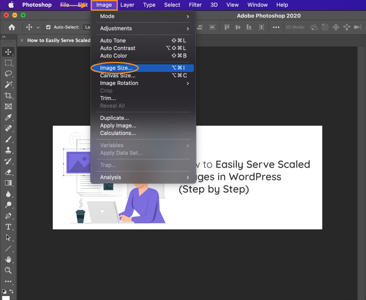
- प्रकट होने वाले डायलॉग बॉक्स में, वेबपेज' की डिस्प्ले आवश्यकताओं के अनुसार छवि का आकार बदलें।.
उदाहरण के लिए, यदि आपकी मूल छवि 1281 x 493 पिक्सेल है और आप इसे 3600 x 2400 पिक्सेल तक स्केल करना चाहते हैं, तो नई आयाम दर्ज करें।.
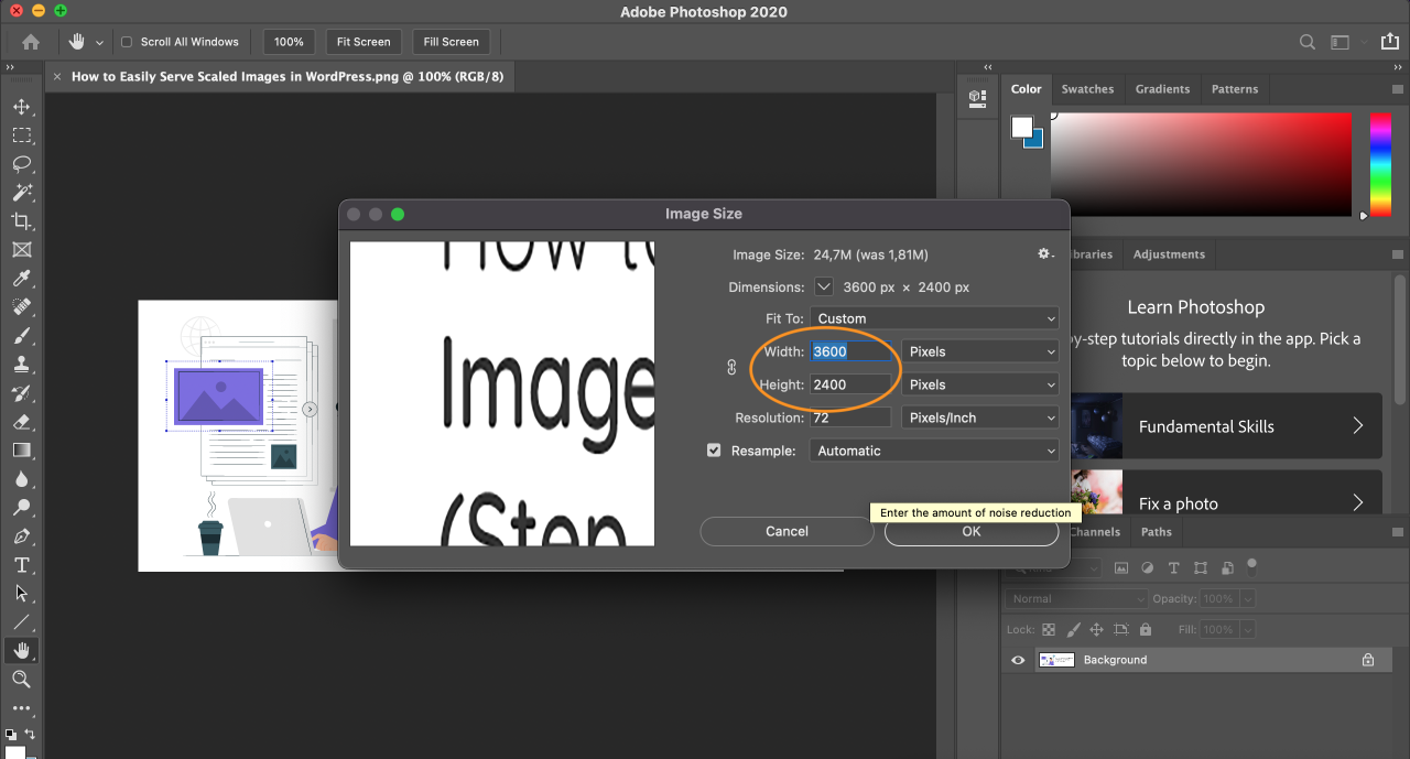
- बदलें रिज़ॉल्यूशन को वेब उपयोग के लिए 72 PPI पर, या यदि आपको उच्च प्रिंट गुणवत्ता चाहिए तो 300 PPI पर।
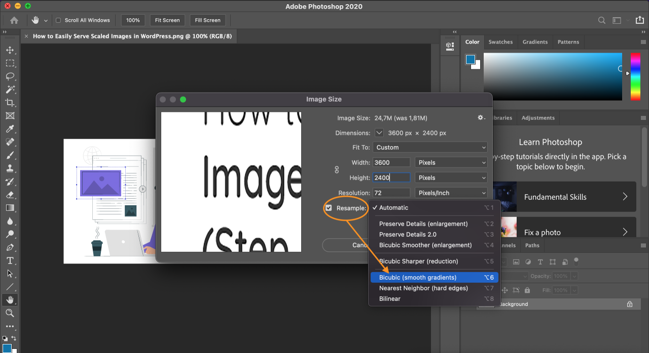
- फिर, एक री-सैंपलिंग विधि चुनें। वेब अनुकूलन के लिए दो सबसे उपयुक्त विकल्प हैं:
बिक्यूबिक स्मूथर: उच्च शोर वाले फ़ोटो को बड़ा करने पर नरम छवियां बनाता है, जो परिपूर्ण है।
- क्लिक करें OK परिवर्तन लागू करने के लिए। आपकी छवि अब आकार बदल दी गई है।
- छवि को सहेजने के लिए, खोलें फ़ाइल टैब और चुनें निर्यात.
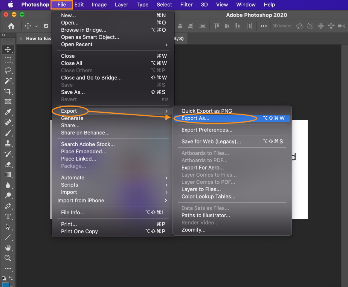
- क्लिक करें निर्यात करें और किसी भी फ़ाइल फ़ॉर्मेट को चुनें और सेटिंग्स को समायोजित करें ताकि बहुत अधिक छवि गुणवत्ता खोए बिना सबसे छोटा संभव फ़ाइल आकार प्राप्त हो सके।
2. WordPress' के अंतर्निर्मित इमेज साइजेज़ का उपयोग करें
यदि आप किसी तृतीय‑पक्षीय सॉफ़्टवेयर को स्थापित नहीं करना चाहते हैं, तो आप वर्डप्रेस में निर्मित इमेज एडिटर का उपयोग कर सकते हैं। इस टूल के साथ, आप क्रॉपिंग, फ़्लिपिंग और री‑साइज़िंग जैसी बुनियादी इमेज संपादन कार्य कर सकते हैं।.
आप अपने पोस्ट या मीडिया लाइब्रेरी में किसी भी इमेज पर क्लिक करके इस सुविधा तक पहुँच सकते हैं। अतिरिक्त रूप से, आप अपने थीम की functions.php फ़ाइल को संशोधित करके कस्टम इमेज साइज निर्धारित कर सकते हैं।.
सभी चीज़ों को सरल रखने के लिए, चलिए' नीचे एक बुनियादी गाइड से शुरू करते हैं:
- अपनी छवि को अपने WordPress पोस्ट में अपलोड करें।.
- छवि चुनें, फिर क्लिक करें Replace और चुनें Open Media Library मेनू से।
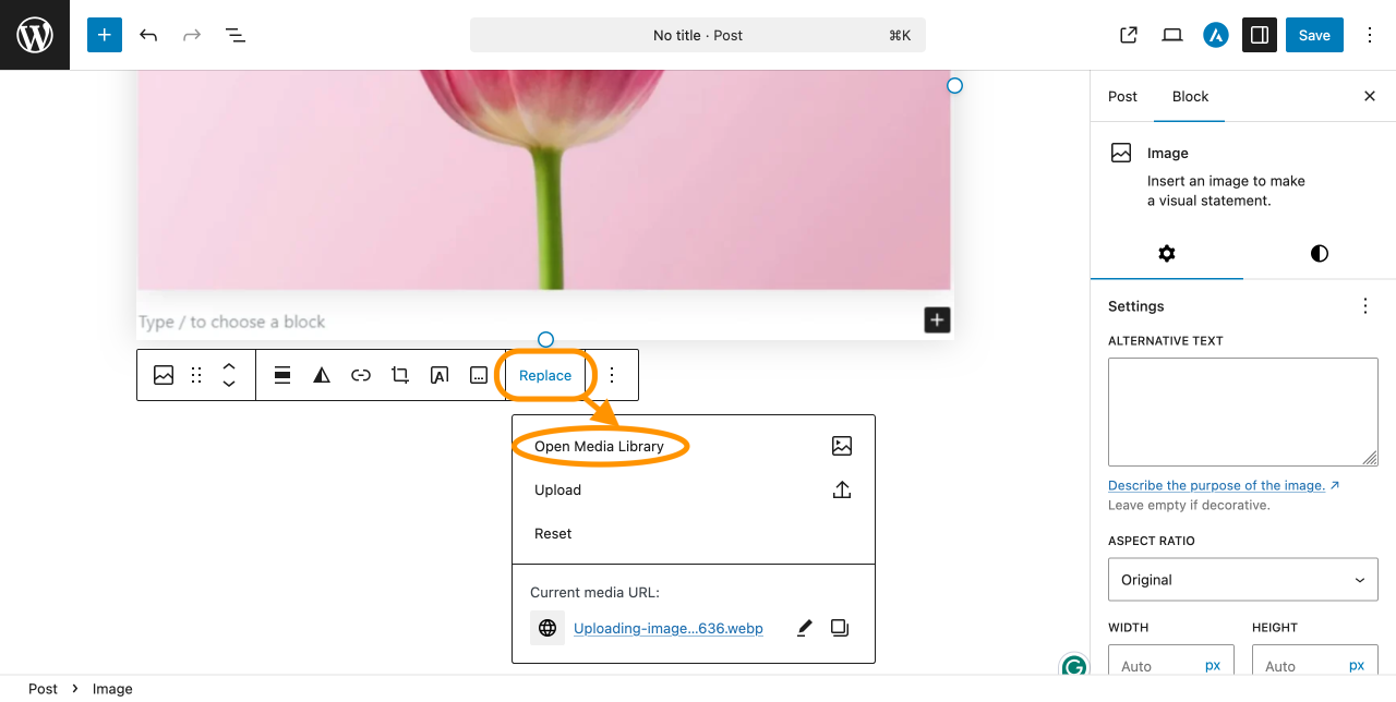
- साइडबार में, क्लिक करें Edit Image.
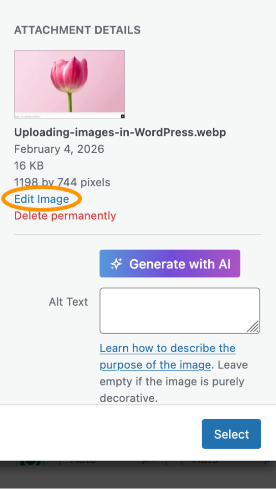
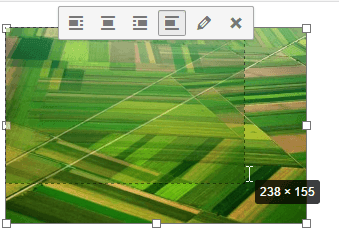
- आपको इमेज एडिटर पर ले जाया जाएगा। क्लिक करें स्केल एक छवि का आकार बदलने के लिए
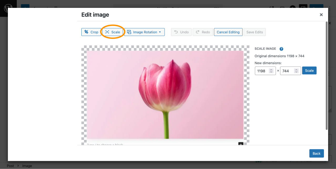
- दर्ज करें नई आयाम अपनी छवि के लिए। उदाहरण के लिए, इसे बदलें 1198 × 744 पिक्सेल से 805 x 500 पिक्सेल. पहलू अनुपात प्रतिबंधित है, इसलिए अन्य मान स्वचालित रूप से चौड़ाई या ऊँचाई के आधार पर समायोजित होगा।
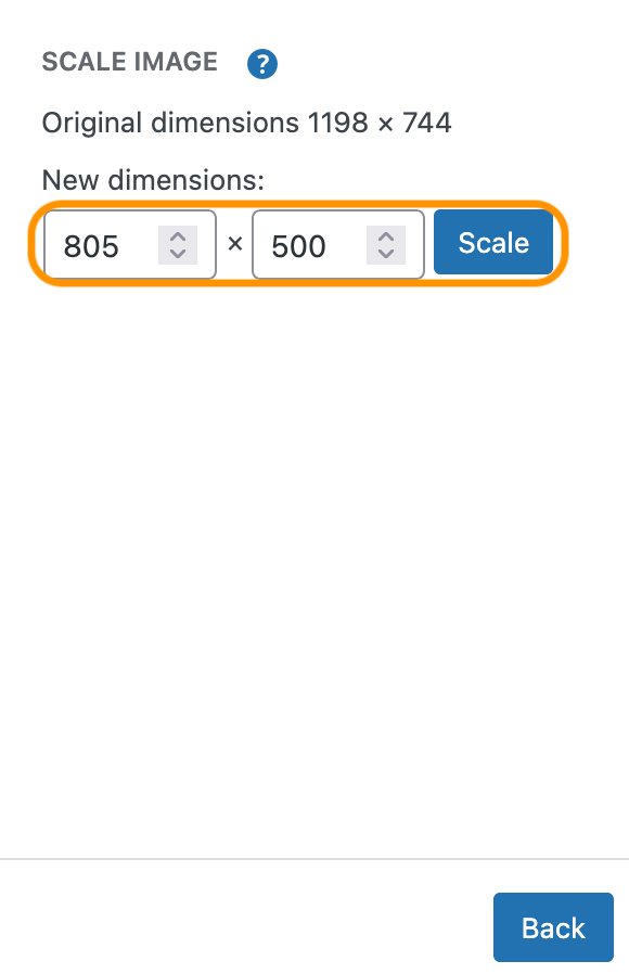
- क्लिक करें स्केल बटन परिवर्तन लागू करने के लिए।
- आपकी छवि अब स्केल की गई है और आपके पोस्ट में उपयोग के लिए तैयार है।.
3. प्लगइन्स का उपयोग करें
WP Meta SEO एक अंतर्निहित डायनेमिक इमेज रिसाइज़िंग फीचर शामिल करता है जो सुनिश्चित करता है कि छवियां आपके लेआउट द्वारा आवश्यक सटीक आयामों पर प्रदर्शित हों। यह अनावश्यक फ़ाइल आकार को कम करने और बड़े आकार की छवियों के कारण आपके पृष्ठों को धीमा होने से रोकने में मदद करता है।
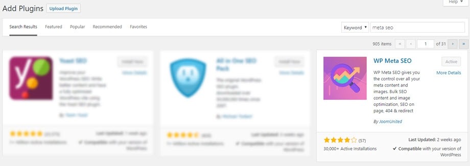
- अपने WordPress साइट पर WP Meta SEO स्थापित करें और सक्रिय करें।.
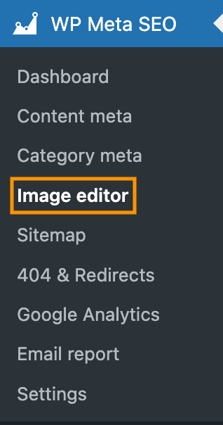
- अपने WordPress डैशबोर्ड से, WP Meta SEO > इमेज एडिटर पर जाएँ।.
- Image SEO & HTML Resize सेटिंग्स खोलें।.
- डायनामिक इमेज रिसाइज़िंग विकल्प सक्षम करें ताकि WP Meta SEO स्वचालित रूप से इमेजेज को उनके डिस्प्ले आकार के आधार पर रिसाइज़ कर सके।.
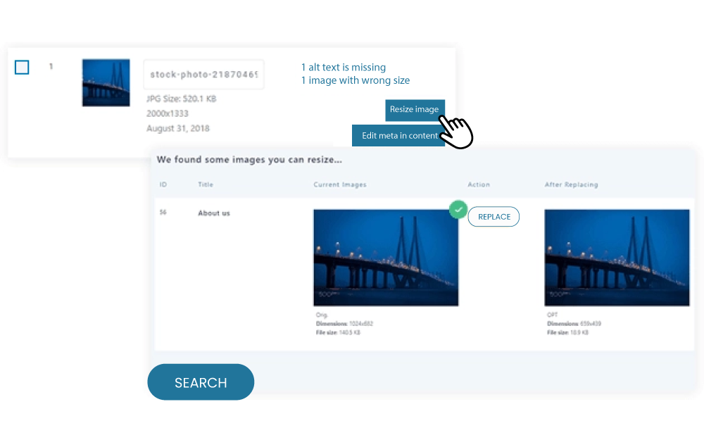
- फ़्रंट एंड पर इमेजेज कैसे रिसाइज़ होते हैं, इसे नियंत्रित करने के लिए अधिकतम चौड़ाई और ऊँचाई मान निर्धारित करें।.
एक बार सक्षम होने पर, WP Meta SEO स्वचालित रूप से आपके साइट पर प्रदर्शित होने पर छवि आयामों को समायोजित करेगा, बिना मैनुअल हस्तक्षेप के इष्टतम छवि आकार सुनिश्चित करता है। यह तरीका पेज गति को सुधारता है, SEO प्रदर्शन को बढ़ाता है, और बेहतर उपयोगकर्ता अनुभव प्रदान करता है—विशेष रूप से छवि-भारी वेबसाइटों के लिए।.
अधिक विवरण के लिए, आप आधिकारिक दस्तावेज़ और फीचर अवलोकन का अन्वेषण कर सकते हैं:
- WP Meta SEO इमेज SEO & HTML रिसाइज़ फीचर
- डायनामिक छवि रिसाइज़िंग दस्तावेज़
आज ही अपनी रैंकिंग बढ़ाएं और एसईओ प्रबंधन को सरल बनाएं!
WP Meta SEO आपको अपने सभी एसईओ अनुकूलन पर नियंत्रण देता है। थोक एसईओ सामग्री और छवि एसईओ, पृष्ठ सामग्री जांच, 404 और पुनर्निर्देशित।.
4. srcset एट्रिब्यूट का उपयोग करके रिस्पॉन्सिव इमेजेज़ लागू करें
यह srcset एट्रिब्यूट का उपयोग किया जाता है
उदाहरण के लिए, यदि कोई उपयोगकर्ता आपके वेबसाइट को एक कम-रिज़ॉल्यूशन डिस्प्ले वाले मोबाइल डिवाइस पर एक्सेस करता है, तो ब्राउज़र एक कम-रिज़ॉल्यूशन छवि लोड करेगा ताकि एक सुगम अनुभव प्रदान किया जा सके।.
यदि आप मैन्युअल रूप से स्केल्ड इमेजेज़ सर्व करने का तरीका जानना चाहते हैं, तो नीचे दिए गए निर्देशों का पालन करें:
- अपने कोड एडिटर के माध्यम से वेबसाइट' की HTML फ़ाइल खोलें।.
- खोजें <img> टैग उस इमेज के लिए जिसे आप अनुकूलित करना चाहते हैं।
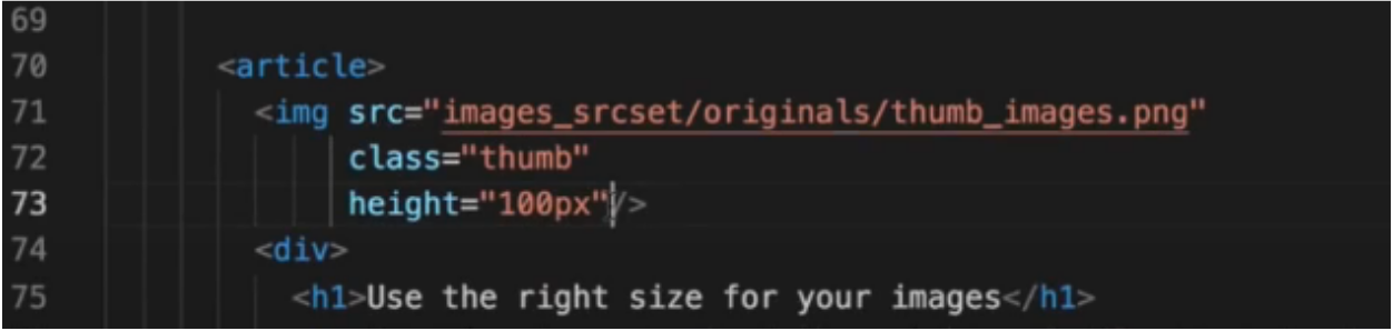
- टैग को संपादित करें और srcset एट्रिब्यूट जोड़ें, जैसा कि चित्र में दिखाया गया है।.
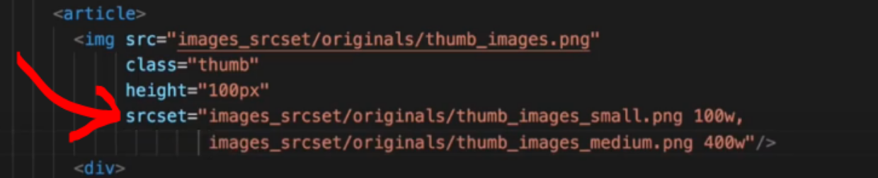
इस उदाहरण में, 100w और 400w प्रत्येक छवि की वास्तविक चौड़ाई दर्शाते हैं। ब्राउज़र इस जानकारी का उपयोग उपयोगकर्ता' के डिवाइस के लिए कौन सी छवि लोड करनी है, यह तय करने के लिए करेगा।.
- परिवर्तनों को सहेजें और परिणाम देखने के लिए अपनी वेबसाइट को पुनः लोड करें।.
अनस्केल्ड इमेजेज़ की पहचान कैसे करें
छवियों को अनुकूलित करना सीखने के बाद, it's भी महत्वपूर्ण है कि यह पहचाना जाए कि कौन सी छवियों को अभी भी स्केल करने की आवश्यकता है और कौन सी पहले से ही अनुकूलित हैं।.
किसी भी अनस्केल्ड छवि की जाँच करने के दो सामान्य तरीके हैं, या तो टूल्स का उपयोग करके या नियमित साइट ऑडिट करके। नीचे ट्यूटोरियल का पालन करें:
1. गूगल पेजस्पीड इनसाइट्स का उपयोग करके
यह एक आवश्यक उपकरण है जो आपके वेबसाइट को तेज़ बनाने में मदद के लिए सुझाव प्रदान करता है। ये सुझाव गूगल लाइटहाउस का उपयोग करके गहन विश्लेषण के माध्यम से उत्पन्न होते हैं। एक सामान्य सुझाव है कि किसी भी छवि को जो अनस्केल्ड के रूप में चिह्नित है, सही ढंग से स्केल किया जाए।.
एक त्वरित जांच करने के लिए, आप नीचे दिए गए निर्देश का पालन कर सकते हैं:
- Google PageSpeed Insight खोलें यहाँ https://pagespeed.web.dev.
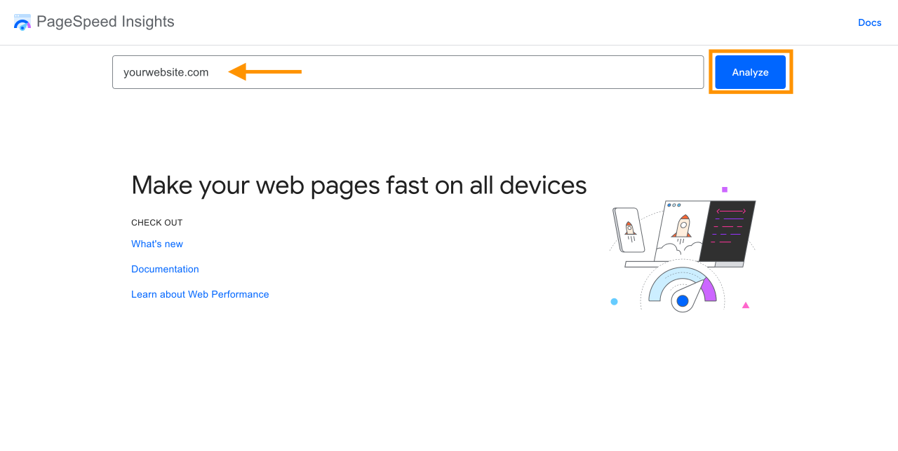
- पूरा पेस्ट करें आपके वेबपेज का URL इनपुट फ़ील्ड में डालें।
- क्लिक करें Analyze प्रक्रिया शुरू करने के लिए।
- इसे समाप्त होने तक प्रतीक्षा करें। PSI तब आपको एक प्रदर्शन रिपोर्ट प्रदान करेगा।.
- नीचे स्क्रॉल करें ताकि एक प्रविष्टि लेबल की गई मिले छवियों का सही आकार.
- यदि मौजूद है, तो आप अपनी साइट पर पाए गए अनस्केल्ड छवियों की सूची देखेंगे।.
यदि आपकी किसी छवि को अनस्केल्ड के रूप में चिह्नित किया गया है, तो Google PageSpeed Insights कई सुझाव दे सकता है, जिसमें शामिल हैं:
- अगली पीढ़ी के फ़ॉर्मेट में छवियों की सेवा, जैसे WebP, AVIF, JPEG XR, या JPEG2000.
- छवियों को सही ढंग से आकार बदलना विभिन्न आकार आवश्यकताओं को पूरा करने के लिए, जैसे उत्पाद विवरण पृष्ठ के लिए 1000 x 1000 पिक्सेल तक आकार बदलना, या उत्पाद सूची पृष्ठ के लिए 400 x 400 पिक्सेल तक आकार बदलना।.
- lazy loadingका उपयोग करके, केवल उपयोगकर्ता'स स्क्रीन पर दिखाई देने वाली छवियों को तुरंत लोड किया जाता है।.
अव्यवस्थित मीडिया लाइब्रेरी को अलविदा कहें।.
WP Media Folder आपको फ़ाइलों को वर्गीकृत करने, क्लाउड स्टोरेज के साथ फ़ोल्डर सिंक करने, अद्भुत गैलरी बनाने और लिंक तोड़ने के बिना चित्रों को बदलने की अनुमति देता है।
आज ही अपने मीडिया वर्कफ़्लो को अनुकूलित करें
2. नियमित साइट ऑडिट करना
नियमित साइट ऑडिट करने से आपको आपकी साइट'स स्वास्थ्य और प्रदर्शन के बारे में गहरी अंतर्दृष्टि मिलती है।.
ऑडिट करते समय, संभावित समस्याओं को उजागर करने के लिए अपनी साइट आर्किटेक्चर और उपयोगकर्ता अनुभव की समीक्षा को प्राथमिकता देने का प्रयास करें।.
यह प्रक्रिया छवि अनुकूलन के अवसर भी उजागर कर सकती है। सुनिश्चित करें कि आप अपनी साइट को विभिन्न उपकरणों, जैसे मोबाइल, टैबलेट और डेस्कटॉप पर परीक्षण करें, ताकि एक सुसंगत अनुभव सुनिश्चित हो सके।.
इसके अलावा, ध्यान दें कि क्या छवियां सही ढंग से स्केल की गई हैं। यदि वे' नहीं हैं, तो ऊपर दिए गए ट्यूटोरियल को फॉलो करना न भूलें।.
निष्कर्ष
स्केल की गई छवियों का उपयोग साइट प्रदर्शन को अनुकूलित करने के लिए आवश्यक है, विशेष रूप से मोबाइल उपकरणों पर। यह आपके पृष्ठों को तेज़ लोड करने में मदद करता है और बाउंस रेट को कम करता है।.
हालांकि, बड़ी संख्या में छवियों को स्केल करना समय-साध्य हो सकता है। एक प्लगइन जैसे WP Media Folder, जो आपको स्वचालित रूप से आकार बदलने, व्यवस्थित करने और छवियों को बदलने की अनुमति देता है जबकि यह सुनिश्चित करता है कि वे प्रदर्शन के लिए अनुकूलित रहें।
जब आप ब्लॉग की सदस्यता लेते हैं, तो हम आपको एक ईमेल भेजेंगे जब साइट पर नए अपडेट होंगे ताकि आप उन्हें न चूकें।.

टिप्पणियाँ