 WordPress products
 Joomla products
 Support
 News
News Login
LoginSplitting Blocks with Advanced Gutenberg Columns Manager

Columns are to content what Gutenberg’s blocks were to WordPress’ classic editor. They allow you to organize your content unhindered - if not vertically, like blocks, then horizontally. Advanced Gutenberg’s latest update presents a new block to help you get up and running with columns.
Advanced Gutenberg’s columns manager is a more advanced take on Gutenberg’s native columns. Its flagship features give you more control over how content should be displayed, but at the same time, it makes it easier to start creating content with its preset layouts.
Column Layouts
To create your first columns block, look for the columns manager in your WordPress Gutenberg editor. The first thing that you will see upon clicking on the new block is a list of the most common preset layouts. The options range from a simple, one-column layout to standard two-column displays and up to six columns in one block.
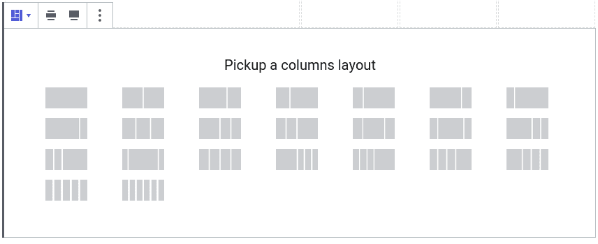
These options are there so you can focus on creating content instead of designing it. However, you may find yourself looking for a layout that does not exist, such as a columns block that takes up only 50% of your blog’s width. In that case, you can use the sidebar to define your own column widths.
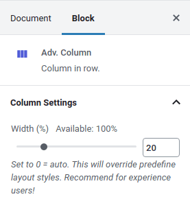
To define your own widths, click on a column and set its width in percent, or set it to 0 to reset it to its automatic width. Keep the total percentages up to 100% at most to avoid the WordPress post or page’s content from overflowing. Column guides - transparent borders - will help you see the changes, but you can turn them off from Advanced Gutenberg’s configuration tab in the settings.
Another novelty in the columns manager is the alignment section. If you click on the outer columns manager block, you will find the width options first. You can toggle the wide width or full width options to increase the size of the columns block. Just after them are the alignment options.
The first three alignment options are standard - columns can either vertically align at the top, in the middle or at the end. The fourth and last alignment option is one that is not in Gutenberg’s columns - inner columns full height.
The option stretches the columns to be equal to the tallest column in the block. This option is necessary if columns have background colors or borders, and thus need to span the entirety of the block’s height.
Responsive Columns
A good blog should display well on desktops, tablets and mobile phones. A pertinent question that arises naturally is how to best display columns when width is lacking. Should the columns’ widths change, and if so, how? Should each column be its own line?
Advanced Gutenberg gives you the flexibility to choose how columns should display on tablets and mobiles. Click on the columns manager block and choose a layout for desktops, tablets and mobiles. The options on handheld devices include changing the column layout or stacking the columns to exploit the full width.
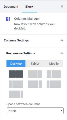
If you are using the wide width of full-width layouts, you may find that the columns manager block is too wide on smaller devices. In that case, you can set up the mobile or tablet padding and margin in the area just below the mobile and tablet layouts respectively.
By scrolling to the bottom and opening up the row settings, you can also specify what should happen when columns overflow with content, and the maximum width and the minimum height of a row. Once you acquaint yourself with the block’s general layout display settings, you might want to access even finer responsiveness settings.
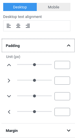
With Advanced Gutenberg’s columns manager, you can also specify the padding and margins of individual columns on desktop or mobile. To fine-tune them, click on a column instead of the entire block. Then, scroll to the bottom of the sidebar to specify the padding and margins on desktop or mobile. For each, you can also specify the text alignment.
Personalizing WordPress Columns
When you are done perfecting your columns - or if you did not feel the need to budge from the standard layouts - you can either personalize columns or start adding content to them. When you click on a column, you can apply column-wide display options, currently limited to the border style, color, width and radius.
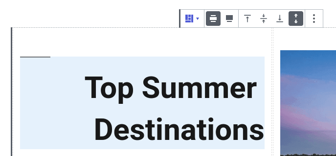
Most importantly, the point of columns is to store and display content. Advanced Gutenberg’s column manager supports all types of content in columns, which means that you can store in them paragraphs, images and galleries, and any other block, whether standard or custom. Your imagination is the limit!

Once you master the power of Gutenberg blocks, you can express your creativity in your WordPress posts and pages. With Advanced Gutenberg’s columns manager, you can get the most out of your WordPress blog. So seize as much or as little control as you want with columns and unleash your creativity not only vertically, but also horizontally!
Get Advanced Gutenberg (free plugin): https://www.joomunited.com/wordpress-products/advanced-gutenberg
When you subscribe to the blog, we will send you an e-mail when there are new updates on the site so you wouldn't miss them.

Comments