 WordPress products
 Joomla products
 Support
 News
News Login
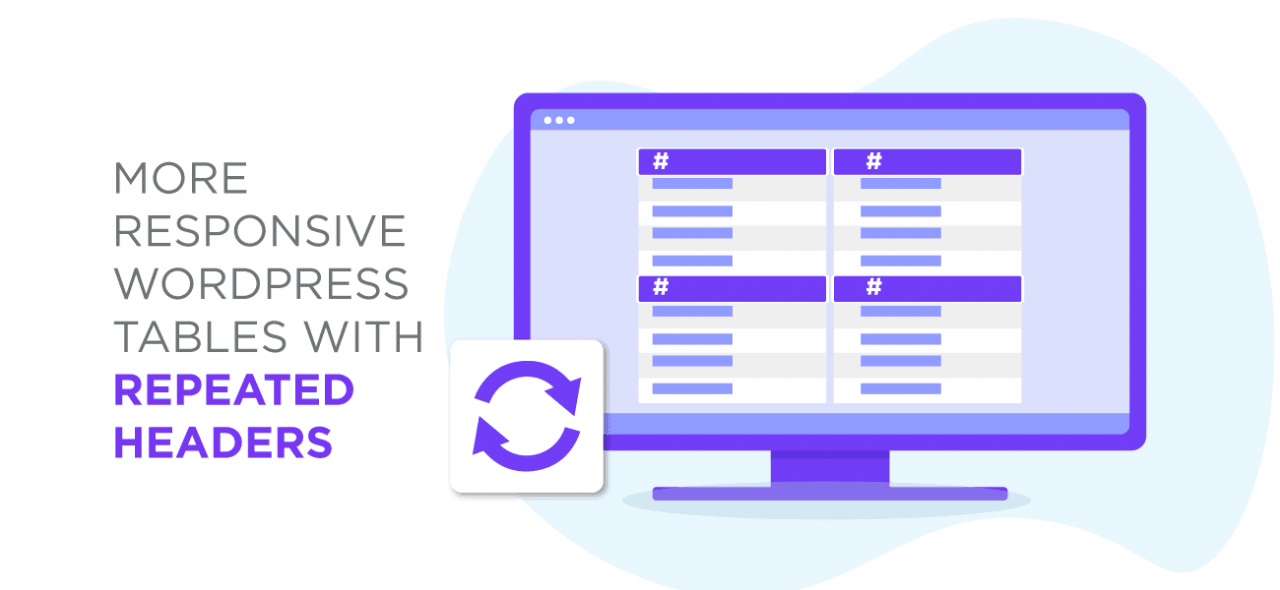
LoginMore responsive WordPress tables with repeated headers
WordPress tables are a double-edged sword, in spite of WordPress' progress over the years. They are the perfect candidates to present data, but unfavorable to tell a story. If you think that's not bad enough, wait until you hear about smartphones and tablets: devices where you have even less space to display data. There are some table disadvantages you have to learn to live with, but responsiveness is not one of them.
The last major update to WP Table Manager introduced a new responsive design for tables with additional responsive options. Now, there's a newer and better version of the WordPress table manager that adds a new responsive mode and new options to help you customize responsive tables and their behavior: repeated headers.
Looking for a robust table management solution for client websites?
From pricing tables to product comparisons, this plugin offers powerful features to present data in a clear and user-friendly manner.
Get the competitive edge now!
Responsive tables with repeated headers
What happens when there is not enough space to display a table? In the previous update, WP Table Manager gave you two responsive options: adding a scroll bar and hiding columns. These two modes have their applications, but if you want to avoid horizontal scrolling or hiding data, the new third mode might be what you're looking for: repeated headers.
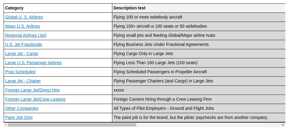
The repeated headers responsive mode, like all other modes, defaults to a normal table when there is enough space, such as on a desktop device, like computers or laptops. When there isn't enough space, it collapses into a simpler table with two columns: the table header and the row's value.
In practice, this means that if you have four columns in a table, each row in the original table will be represented as four new rows in the responsive version. Each new row only has the original header and its data value. This scheme applies for each row in the original table, so there is always a repeated header next to data values.
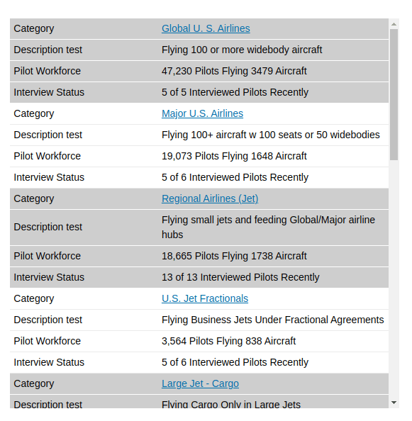
Thanks to this simple responsive behavior, the repeated headers table mode lets you add as much data as you want to your tables without ever having to worry about how it will look on mobiles and tablets. In addition, WP Table Manager uses alternating colors for rows on smaller devices: each row in the original table gets a different color, preserving the context and allowing your WordPress readers to distinguish between records.
Customizing responsive tables in repeated headers mode
You can choose the repeated headers mode when editing a table: choose responsive options from the format menu, and then look for the repeated header mode from the first dropdown. You can also customize the repeated headers table in two ways: the responsive breakpoint and the responsive maximum height.
The responsive breakpoint is the width below which the WordPress table manager plugin stops rendering the table as usual, and instead switches over to the responsive, repeated headers mode. You can estimate this value based on your WordPress theme and on how many columns you have: if you think the table won't fit below a certain width, use it as the breakpoint.
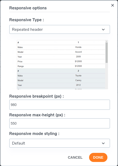
If you have many rows or many columns, it's possible that the repeated headers mode will create a very long page. The responsive maximum height deals with this problem by capping the height of the repeated headers table in responsive mode. If the responsive table is too long, your WordPress readers can use a scrollbar to view more data as usual.
Calling all webmasters!
Enhance your client websites with WP Table Manager. Easily manage and customize tables, charts, and spreadsheets, providing clients with dynamic and engaging data visualizations.
Upgrade your web design services today!
There is no magic bullet for responsive tables, but the repeated headers mode for WordPress tables comes close. Whether you have a small table or a large table with many rows and columns, WP Table Manager's new repeated headers mode makes sure your data always fits, whatever the device.
When you subscribe to the blog, we will send you an e-mail when there are new updates on the site so you wouldn't miss them.