


Better responsive tables on Joomla

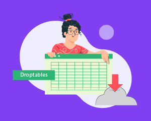
Droptables has all but mastered tables for Joomla. In recent updates, Droptables has added support for more types of data, more ways to process numbers with equations, and new options to style tables with themes like they were spreadsheets. The latest update concerns everything at once because it affects everything at once: better responsive tables for Joomla.
The one concern with tables is the space they occupy. On a desktop environment, a web browser might comfortably fit a large table or, at least, make navigating it easier. On a tablet or mobile device, however, even a small table might not fit comfortably. The latest version of Droptables for Joomla has added new features to help your tables look better on desktop, tablets and smartphones. Let's dive in!
Attention Joomla webmasters!
Enhance your client websites with Droptables. Create and manage dynamic and visually stunning
tables effortlessly.
Impress your clients with professional data presentation.
Responsive Joomla table themes
Over the years, Droptables has added many features to Joomla tables, enough to blur the separation between simple tables and more complex spreadsheets. The challenge, then, becomes how to reproduce tables in such a way that they appear the same or, at least, as similar as possible on both desktop devices and tablets and mobiles.
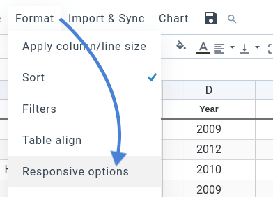
Droptables 3.7's latest update continues to make the responsive transition on Joomla blogs more seamless. All responsive options appear in the table manager, under the Format menu: the aptly-named responsive options item. From here, you can manage your table's behavior on different types of devices, regardless of how large or small they may be.
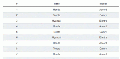
You can, for instance, choose what type of responsive Joomla table you want. Responsive tables can either have scrollbars on small devices or they could hide some columns to fit the most important data and figures. You could also set the table to repeat headers, which re-structures the table to replace columns with a one-dimensional view. GIFs, like the one below, demonstrate the table's behavior to help you choose.
Depending on the type of responsive behavior you choose, you can configure the theme at a finer granularity. In the scrolling mode, for example, you can set the table's height. If you choose to hide columns, you can choose the most important features, which Droptables prioritizes when deciding what data to show. And if you prefer to repeat headers to display all data in a compact view, Droptables 3.7 has introduced new options.
Retaining table style on tablets and mobile devices
The list of responsive options keeps getting longer, and this time, it was the repeated headers' turn to receive an update. The repeated headers view for responsive Joomla tables now has three options: the table's breakpoint, the maximum height, and the styling.
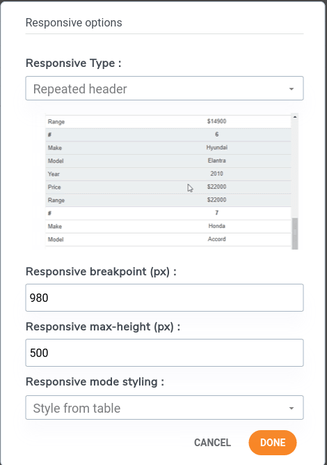
The breakpoint establishes when a table becomes responsive. When the web browser's viewpoint, or the visible area of your Joomla blog, falls below a certain width, Droptables automatically switches from the default table view to the repeated headers view. On mobile devices, for example, the viewpoint is the width, in pixels, of the device, which triggers the responsive view.
The responsive height serves a different purpose. Since the repeated headers view uses somewhat of a one-dimensional representation of data, with only two columns, a table can quickly devolve into an extremely-long element hogging your Joomla blog. Therefore similarly to the scroll view, the responsive height establishes a maximum height for a responsive table.
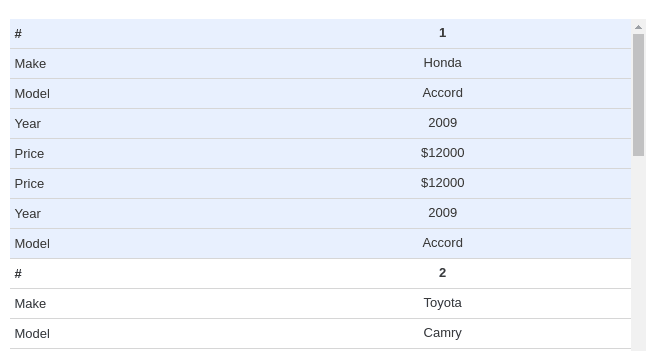
Finally, the last option, the responsive mode styling. Previously, Droptables would mark the different columns—now rows beneath each other in the repeated headings view–by alternating gray colors. If you had applied your own table style, Droptables overwrote most styling options. You can still choose that option, the default responsive mode styling, but now, in the latest version, you can also choose to style from table, which retains your style and theme.
Calling all Joomla webmasters!
Simplify table creation and management for client websites with Droptables. From pricing tables
to data comparisons,
this extension offers powerful features and intuitive editing tools.
Upgrade your web design services
today!
Tables represent a great way to display data in a universally-understood format. Tablets and mobile devices, however, were not designed for large data. Not to worry, Droptables keeps improving on both fronts, letting you improve your data and its presentation on Joomla, and ensuring that your tables look perfect, whether on desktop, on tablets or on smartphones.
And it is fully compatible with the Excel feature!
If you need tables on Joomla, you simply cannot go wrong with Droptables. Check out the plugin here.
When you subscribe to the blog, we will send you an e-mail when there are new updates on the site so you wouldn't miss them.

Comments